RT Dromo is a typographic line-up of vintage concert ticket typography from the 1980s performed with the sturdiness of an all-purpose grotesque. Echoing functionalist shapes proven in the challenging environments of impact printing it remixes them into a contemporary digital composition.
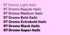
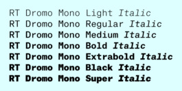
The new RT Dromo Collection comes in a total of 16 fonts in 4 weights, freshly complemented with corresponding italic and monospace styles. Once conceived as a single weight custom typeface, RT Dromo is now a versatile family for a wide range of uses.


ORIGIN
The Book
Lurker Grand and Edition Patrick Frey had already published “Hot Love: Swiss Punk & Wave 1976-1980” in 2006 and “Heute und Danach: The Swiss Underground Music Scene of the 80s” in 2012. These books document the history of the Swiss music scene and contextualize it within the Swiss cultural history in general. The last publication of the trilogy would come to be “Die Not hat ein Ende: The Swiss Art of Rock”. Other than its predecessors it focuses specifically on the visualization of these subcultures through posters, flyers, fanzines and other ephemera.


Cornel Windlin, 1994
Unknown Artist, 1960
Unknown Artist, 1990


Jacques Schouwey, 1983
Düde Dürst, 1968
Studio UFO was commissioned to design the upcoming book and approached me for a custom typeface. We had known each other from our studies in Visual Communication at the Zurich University of Arts and had all just recently graduated. It seemed like a great opportunity to collaborate and gain experience in our respective fields. In a first meeting we reviewed some of the material to be used in the book and discussed possible directions.

A typographic selection from printed ephemera shown in the book “Die Not hat ein Ende: The Swiss Art of Rock”
I was shown a large variety of ephemera. Psychedelic lettering, DIY copy machine layouts and horror movie style headlines were all part of the heterogeneous material. Given the diversity I figured drawing inspiration directly from the content was not an option. Any prioritization would feel arbitrary and subjective. Something solid was required to guide the reader through this typographic jungle while still addressing the raw nature of the content. To keep the scope of the project manageable we agreed in advance to a single weight with a proportional and a monospace style.
The Tickets

In search of a starting point, I stumbled upon the typography of vintage concert tickets. The constructed monospace fonts with their technical appearance are softened by the rough quality of the impact printing and convey a special organic tension. Since we all liked the aesthetic and the connection to the subject of the book we decided to pursue this approach further.

Among the numerous tickets I reviewed, one design seemed to constantly reappear. The tickets and backgrounds varied but the type remained the same in style and typesetting (examples pictured above). After a bit of searching, I managed to order two tickets for closer inspection (pictured below).

The specific layout consists of several lines of monospace type. They alternate between a larger and a smaller style while the former almost seems to work as a small cap companion. We were specifically interested in the smaller type which would come to form the base for RT Dromo.

The two styles had quite a few differences: The large type measures almost double the height of the small type, is therefore more condensed and partly differs in construction. On the other hand there were also notable similarities: Both share the same horizontal space, stem thickness and large parts of the glyph structure. They were similar enough to think of them as two sets of glyphs within a font but at the same time distinguishable enough to leave me with reasonable doubts. In my attempt to find out more I started looking into typewriter typefaces, the modern day origin of monospace fonts.
The Typewriter
As the scope of applications for typewriters grew at the beginning of the 20th century, so did the demand for more specific type styles. A larger variety was made available for more specific tasks than before. To insure proper communication of respective selling points, distributors often set sample text in their specimen with a suggestion of use for each font.

Sample of “Pica Double Gothic” explaining the usage of double-gothics in a 1961 Adler type styles catalogue found here
Among the more specialized examples were so-called “double-gothic” typefaces. They are characterized by including a set of uppercase letters while the corresponding small-caps take the place of the lowercase. “Double” refers to the two uppercase-shaped glyph sets while “gothic” is simply the American term for sans-serif.
The double-gothic small caps were quite close to what I was looking for. The ticket font displayed two full glyph sets though, including figures, punctuation and symbols. All the double-gothics offered were two sets of letters. To this day I wasn’t able to clearly identify the font from the tickets but it might as well never have had a name to begin with. I suspect that it was most likely a proprietary typeface directly built into the printing device itself.
DESIGN
1. Uniform Proportions
2. Straight Segments
I incorporated two key features from the collected material: 1. the uniform proportions and 2. the straight segments of the round letters. Instead of a direct reference think of the ticket font as a source track of a sample. Useful elements have been extracted out of their original context, modified and repurposed to produce a new piece. Looping them throughout the character set created a harmonious mix between a distinct personality and precise functionality.
Uniform Proportions


Ticket type (large)
Ticket type (small)
RT Dromo
At a decreased height the small ticket type still shares the same width as the large type. This framework compresses the glyphs vertically which leads to a specific height-to-width relationship resembling small caps. With their square proportions and boxy looks they served as my starting point for RT Dromo’s uppercase.
RT Dromo - RT Dromo Mono
In a monospace font, like the one on the tickets, all glyphs share the same horizontal space. Therefore the letters need to approximate each other in width to achieve an even text color. For example, narrow ones like r need to be drawn wider to fill the space while wide ones like m need to be drawn narrower to fit within it.

Comparison of horizontal proportions between RT Rondelle (top) and RT Dromo (middle and bottom).
I turned this approximation into a stylistic feature and drew the letters similar in width across the alphabet. So, while RT Dromo is a proportional typeface with all advantages that come with it, its monospace origins continue to quietly play in the background.
Usually the other way around, this time I started the lowercase by transferring the key features from the uppercase. The relationship between H and O served as a model for the design of n and o and extended the principle of similar widths to the lowercase. The design of these key glyphs then established a solid foundation to build their related siblings.


Given RT Dromo’s history it only made sense to complement the release with a proper monospace subfamily, including the full range of weights and corresponding italics. Although initially also developed for the book, RT Dromo Mono was never officially released for public licensing. A handful of befriended designers were handed the original Regular weight for personal use but the reach of the font never exceeded small scale projects. Now entirely reworked it represents a useful extension of the RT Dromo toolkit.
The monospace styles adopt the classic 10-pitch dimensions meaning that at a font size of 12pt 10 letters fit per inch. It may interest you to know that the default glyph width of 600 units in some type design software is derived from exactly that fixed-width standard from the typewriter era.
Straight Segments
It’s interesting how the round letters from the tickets have straight segments. Their original purpose was probably rather practical than aesthetic. Monospace typefaces often had to retain legibility in challenging environments. Besides their space saving property the straight segments enlarge the counters and help compensate external factors like varying strike intensity, low paper quality and continuous wear of devices especially common in short-lived products like tickets.
Straight segments throughout the character set of RT Dromo
Many such modifications improving legibility in print translate well into digital environments too. RT Dromo takes advantage of these proven techniques. The typeface optimises them for contemporary usage by incorporating them throughout the character set in varying degrees.
The principle of straight segments was extended to other letters as well. The tail of the a and the terminals of f, j and t are some notable examples. Given the technical vibe of the ticket fonts it made sense to reflect that with matching tubular transitions.

RT Dromo (top) - FF Din (bottom)
Straight segments in round glyphs lend themselves to create rather condensed shapes. With RT Dromo I incorporated them into neo-grotesque proportions and steered away from a narrower style. I balanced the length of these segments with the width of the letter while ensuring smooth transitions from straight to round. The typeface manages to preserve the spatially economic advantage of flat sides, while keeping them from becoming too disruptive in a conventional text setting. They help convey its personality in a subtle way while at the same time honoring their functional purpose.

Given their prominence the straight segments are also responsible for the typeface’s name. Since the O resembles the shape of an Olympic racetrack the name is derived from the Greek word “dromos”.
What’s New

“Die Not hat ein Ende: The Swiss Art of Rock” showing RT Dromo and RT Dromo Mono in use for the first time
At the time RT Dromo successfully established a subtle connection between the content of the book and the source of the typeface. Letting the material provide the direction was more an extension of possibilities than a limitation. It lead to new inputs and ultimately new results. It’s irrelevant if the exact process is visible in the outcome because in my opinion the approach always influences the attitude that is conveyed. Instead of arbitrariness and empty aesthetics the design evolves out of the content and makes the process an integral part of the product.
Additional Monospace
New alternate a
Refined Drawing
Improved Spacing + Kerning
Reworked Punctuation
Updated Diacritics
RT Dromo isn’t a brand new design but was the first typeface I started on my own. Revisiting old work is a tricky task. What to keep and what to change can be a fine line to walk. So why bother? In the spirit of its origin I decided to reissue it as a 2024 remastered edition if you will. The right knobs have been tweaked to improve the performance in just the right places. Once conceived for a specific purpose, the new RT Dromo is now a multi-purpose grotesque and a clearer articulation of its original idea.
Check out other Razzia typefaces:
Credits
Typeface
Website
Animations
Designed by Mirco Schiavone, spacing and kerning by Igino Marini
Design, copy writing and documentation by Mirco Schiavone
Designed by Mirco Schiavone and animated by Fabian Luginbühl
RT Dromo is a typographic line-up of vintage concert ticket typography from the 1980s performed with the sturdiness of an all-purpose grotesque. Echoing functionalist shapes proven in the challenging environments of impact printing it remixes them into a contemporary digital composition.
The new RT Dromo Collection comes in a total of 16 fonts in 4 weights, freshly complemented with corresponding italic and monospace styles. Once conceived as a single weight custom typeface, RT Dromo is now a versatile family for a wide range of uses.


ORIGIN
The Book
Lurker Grand and Edition Patrick Frey had already published “Hot Love: Swiss Punk & Wave 1976-1980” in 2006 and “Heute und Danach: The Swiss Underground Music Scene of the 80s” in 2012. These books document the history of the Swiss music scene and contextualize it within the Swiss cultural history in general. The last publication of the trilogy would come to be “Die Not hat ein Ende: The Swiss Art of Rock”. Other than its predecessors it focuses specifically on the visualization of these subcultures through posters, flyers, fanzines and other ephemera.


Cornel Windlin, 1994
Unknown Artist, 1960

Unknown Artist, 1990


Jacques Schouwey, 1983
Düde Dürst, 1968
Studio UFO was commissioned to design the upcoming book and approached me for a custom typeface. We had known each other from our studies in Visual Communication at the Zurich University of Arts and had all just recently graduated. It seemed like a great opportunity to collaborate and gain experience in our respective fields. In a first meeting we reviewed some of the material to be used in the book and discussed possible directions.

A typographic selection from printed ephemera shown in the book “Die Not hat ein Ende: The Swiss Art of Rock”
I was shown a large variety of ephemera. Psychedelic lettering, DIY copy machine layouts and horror movie style headlines were all part of the heterogeneous material. Given the diversity I figured drawing inspiration directly from the content was not an option. Any prioritization would feel arbitrary and subjective. Something solid was required to guide the reader through this typographic jungle while still addressing the raw nature of the content. To keep the scope of the project manageable we agreed in advance to a single weight with a proportional and a monospace style.
The Tickets

In search of a starting point, I stumbled upon the typography of vintage concert tickets. The constructed monospace fonts with their technical appearance are softened by the rough quality of the impact printing and convey a special organic tension. Since we all liked the aesthetic and the connection to the subject of the book we decided to pursue this approach further.

Among the numerous tickets I reviewed, one design seemed to constantly reappear. The tickets and backgrounds varied but the type remained the same in style and typesetting (examples pictured above). After a bit of searching, I managed to order two tickets for closer inspection (pictured below).

The specific layout consists of several lines of monospace type. They alternate between a larger and a smaller style while the former almost seems to work as a small cap companion. We were specifically interested in the smaller type which would come to form the base for RT Dromo.

The two styles had quite a few differences: The large type measures almost double the height of the small type, is therefore more condensed and partly differs in construction. On the other hand there were also notable similarities: Both share the same horizontal space, stem thickness and large parts of the glyph structure. They were similar enough to think of them as two sets of glyphs within a font but at the same time distinguishable enough to leave me with reasonable doubts. In my attempt to find out more I started looking into typewriter typefaces, the modern day origin of monospace fonts.
The Typewriter

Sample of “Pica Double Gothic” explaining the usage of double-gothics in a 1961 Adler type styles catalogue found here
Among the more specialized examples were so-called “double-gothic” typefaces. They are characterized by including a set of uppercase letters while the corresponding small-caps take the place of the lowercase. “Double” refers to the two uppercase-shaped glyph sets while “gothic” is simply the American term for sans-serif.
The double-gothic small caps were quite close to what I was looking for. The ticket font displayed two full glyph sets though, including figures, punctuation and symbols. All the double-gothics offered were two sets of letters. To this day I wasn’t able to clearly identify the font from the tickets but it might as well never have had a name to begin with. I suspect that it was most likely a proprietary typeface directly built into the printing device itself.
DESIGN
1. Uniform Proportions - 2. Straight Segments
I incorporated two key features from the collected material: 1. the uniform proportions and 2. the straight segments of the round letters. Instead of a direct reference think of the ticket font as a source track of a sample. Useful elements have been extracted out of their original context, modified and repurposed to produce a new piece. Looping them throughout the character set created a harmonious mix between a distinct personality and precise functionality.
Uniform Proportions


Ticket type (large) - (small) - RT Dromo
At a decreased height the small ticket type still shares the same width as the large type. This framework compresses the glyphs vertically which leads to a specific height-to-width relationship resembling small caps. With their square proportions and boxy looks they served as my starting point for RT Dromo’s uppercase.
RT Dromo - RT Dromo Mono
In a monospace font, like the one on the tickets, all glyphs share the same horizontal space. Therefore the letters need to approximate each other in width to achieve an even text color. For example, narrow ones like r need to be drawn wider to fill the space while wide ones like m need to be drawn narrower to fit within it.

Comparison of horizontal proportions between RT Rondelle (top) and RT Dromo (middle and bottom).
I turned this approximation into a stylistic feature and drew the letters similar in width across the alphabet. So, while RT Dromo is a proportional typeface with all advantages that come with it, its monospace origins continue to quietly play in the background.
Usually the other way around, this time I started the lowercase by transferring the key features from the uppercase. The relationship between H and O served as a model for the design of n and o and extended the principle of similar widths to the lowercase. The design of these key glyphs then established a solid foundation to build their related siblings.


Given RT Dromo’s history it only made sense to complement the release with a proper monospace subfamily, including the full range of weights and corresponding italics. Although initially also developed for the book, RT Dromo Mono was never officially released for public licensing. A handful of befriended designers were handed the original Regular weight for personal use but the reach of the font never exceeded small scale projects. Now entirely reworked it represents a useful extension of the RT Dromo toolkit.
The monospace styles adopt the classic 10-pitch dimensions meaning that at a font size of 12pt 10 letters fit per inch. It may interest you to know that the default glyph width of 600 units in some type design software is derived from exactly that fixed-width standard from the typewriter era.
Straight Segments
It’s interesting how the round letters from the tickets have straight segments. Their original purpose was probably rather practical than aesthetic. Monospace typefaces often had to retain legibility in challenging environments. Besides their space saving property the straight segments enlarge the counters and help compensate external factors like varying strike intensity, low paper quality and continuous wear of devices especially common in short-lived products like tickets.
Straight segments throughout the character set of RT Dromo
Many such modifications improving legibility in print translate well into digital environments too. RT Dromo takes advantage of these proven techniques. The typeface optimises them for contemporary usage by incorporating them throughout the character set in varying degrees.
The principle of straight segments was extended to other letters as well. The tail of the a and the terminals of f, j and t are some notable examples. Given the technical vibe of the ticket fonts it made sense to reflect that with matching tubular transitions.

RT Dromo (top) - FF Din (bottom)
Straight segments in round glyphs lend themselves to create rather condensed shapes. With RT Dromo I incorporated them into neo-grotesque proportions and steered away from a narrower style. I balanced the length of these segments with the width of the letter while ensuring smooth transitions from straight to round. The typeface manages to preserve the spatially economic advantage of flat sides, while keeping them from becoming too disruptive in a conventional text setting. They help convey its personality in a subtle way while at the same time honoring their functional purpose.

Given their prominence the straight segments are also responsible for the typeface’s name. Since the O resembles the shape of an Olympic racetrack the name is derived from the Greek word “dromos”.
What’s New

“Die Not hat ein Ende: The Swiss Art of Rock” showing RT Dromo and RT Dromo Mono in use for the first time
At the time RT Dromo successfully established a subtle connection between the content of the book and the source of the typeface. Letting the material provide the direction was more an extension of possibilities than a limitation. It lead to new inputs and ultimately new results. It’s irrelevant if the exact process is visible in the outcome because in my opinion the approach always influences the attitude that is conveyed. Instead of arbitrariness and empty aesthetics the design evolves out of the content and makes the process an integral part of the product.
Additional Monospace
New alternate a
Refined Drawing
Improved Spacing + Kerning
Reworked Punctuation
Updated Diacritics
RT Dromo isn’t a brand new design but was the first typeface I started on my own. Revisiting old work is a tricky task. What to keep and what to change can be a fine line to walk. So why bother? In the spirit of its origin I decided to reissue it as a 2024 remastered edition if you will. The right knobs have been tweaked to improve the performance in just the right places. Once conceived for a specific purpose, the new RT Dromo is now a multi-purpose grotesque and a clearer articulation of its original idea.
Check out other Razzia typefaces:
Credits
Typeface
Designed by Mirco Schiavone, spacing and kerning by Igino Marini
Website
Design, copy writing and documentation by Mirco Schiavone
Animations
Designed by Mirco Schiavone and animated by Fabian Luginbühl